Beehive Logo: Local Artist Inspired By Regional Landscape
When you think Beehive Cheese, the first thing you probably think of is cheese. Of course. The second is beehives! Probably. The second thing you might actually think of is your favorite cheese, like Apple Walnut Smoked or Pour Me A Slice. That’s okay, too. Without thinking real hard (or too much), our classic logo will also come to mind: A field of large beehives and two workers bringing a cow in from pasture. The surreal piece, which looks and feels like a classic, captures that essence of who we are… fun, a little strange, and small but memorable.
What’s that, friend? You… you don’t know what we’re talking about? Oh no! I’m gonna need you to buckle in STAT because we’re hitting 88 mph to kick it to the past! It’s time for some history that people who do and don’t know the logo can enjoy.
Let’s start the story here: As they ventured into the world of cheese together, Tim & Pat realized that they needed a logo for their new company, Beehive Cheese. But who would they go to? Finding an artist to do a logo is frankly a pain. And then there’s coming up with a vague idea so the artist has something to work with. It’s a whole process. A whole stress inducing process.
Pat had an idea. Back in college he had framed paintings for an artist, and that artist’s son, Jeremy Winborg, was a friend and an up and coming artist himself. Pat and Tim had always liked his art, feeling like it fit their personalities and therefore the personality of Beehive Cheese. Tim commissioned Jeremy to create something that would give a sense of Beehive Cheese. He delivered.
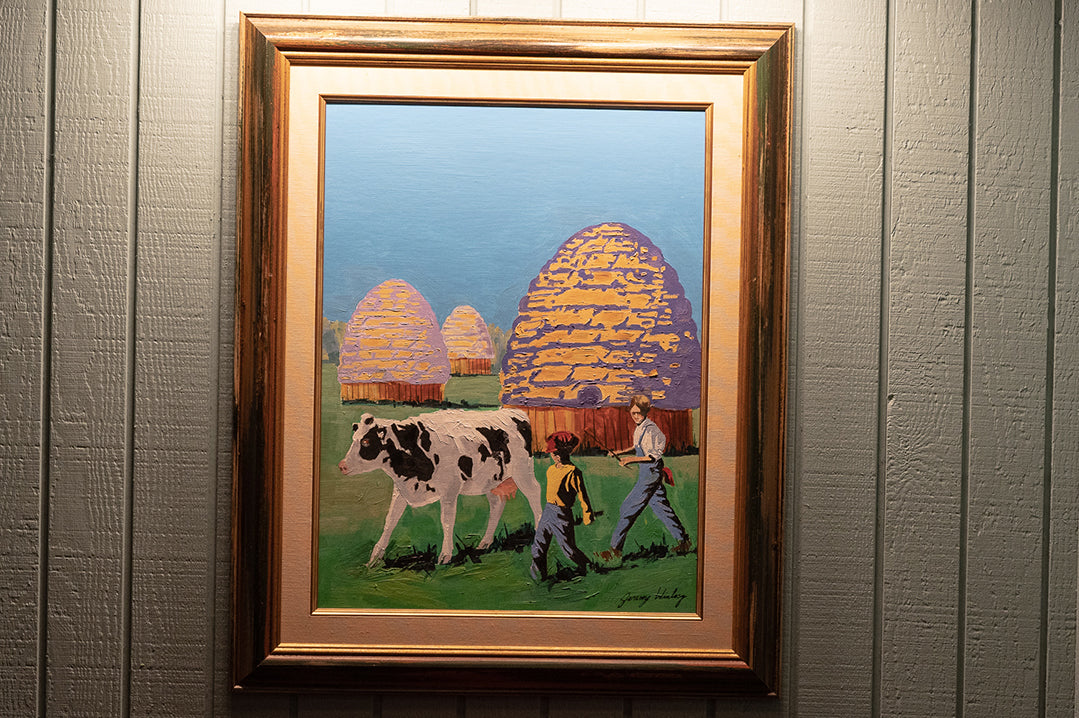
Let’s check it out piece by piece.
- In Jackson Hole, WY, along the river outside of town, you used to find large piles of hay that looked vaguely like mushrooms, according to Pat, because they were stacked up inside 8 foot tall fences that would keep out deer who wandered out of the woods. Jeremy thought that those stacks looked more like beehives than mushrooms, and that was where his inspiration started.
- The two boys walking in with the cow from pasture Pat says represents family, and it’s often joked that they’re Pat and Tim.
- In the first version, Jeremy had painted a steer instead of a cow. When Tim & Pat saw the original finished product, they had to tell Jeremy that he probably needed to change that. They were in the dairy industry, after all, and you can’t get milk from a male cow. Jeremy painted a cow over it.
In 2015, they reached a crossroads. They loved the logo, but they realized over the years that it didn’t translate well to the cheese labels. Enough was going on in the logo to where when it was shrunk down, you could hardly tell what things were outside of the cow. With Pat and Tim’s kids coming back to the company, they knew it was time to make some changes and made the hard decision to change the logo. It wasn’t just the two boys representing Pat and Tim anymore; the heart was still Utah, but the importance was on the whole team now. To show this, they kept the beehive haystack and made it the central focus.
The original painting is proudly hanging in Tim’s house. If you ask him nicely, he might send you a snapshot of it :) I hope you enjoyed this tour through our history, and most importantly I hope you took notes on this because there’s a quiz later.
- Choosing a selection results in a full page refresh.